An example of a diamond in the rough
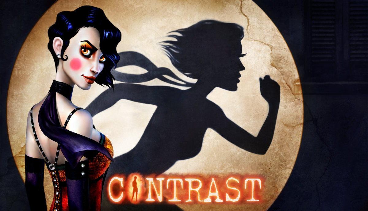
Of all of the games I’ll ever talk about in Indie Game Thing, Contrast will be one game that really surprised me. Mixing the gilded ideals of the 1920’s with childhood innocence, Contrast was one of those games that felt the most like a rollercoaster of emotions. As frustrating as Contrast was to play, its presentation in regards to that frustration made the total experience of Contrast even more special.
Out of all of the games I’ve played this year, I’ve never faced something as “off-feeling” as Contrast. I say this because the controls, from the shadow sidescrolling to the general camera controls, felt wrong. I was never able to connect the main gameplay mechanic, the use of shadows to traverse my surroundings, to general controls. Every time I moved the mouse, I would make at least ten errors in judgment. You can say that I was playing the game badly, but surely, I didn’t feel comfortable playing Contrast.
This discomfort, ironically, helped me grasp the concepts of the story of Contrast. Without divulging much of the plot, you play as Dawn, the “imaginary friend” of a little girl named Didi. Throughout the journey, Dawn must help Didi through her breaking family life. From a screw-up of a father to a mother who just wants to quit life, the characters of Contrast aren’t happy-go-lucky people even though they live in the roaring 20s. One thing to note is that no one, besides Didi, knows you, Dawn, exist. Everyone is shown as a noir-ish shadow, fully displayed in front of bright lights littered amongst the dark alleys and cold city streets.
The art style and the gameplay of Contrast go hand-in-hand to create the confusion and fear of child who is trying to regain a family bent on self-destruction. The buggy mechanics are paired with what looks like the crumbling thoughts of a little girl experiencing family turmoil and strife. From unpaid bills to parents threatening to kill each other, the world Dawn is in feels like the expression of Didi’s inner emotions, emotions that feel lost and distraught and close to breaking. No matter what frustration I had throughout my playthrough, I kept wanting more. I wanted to delve deeper into this insanity of Contrast’s world. All the while, I wanted to see Didi and her family get out of their predicament.
Puzzles take a special note in Contrast because of how badly designed they feel. Mechanics sometimes feel unexplained and random. The way I solved most of the puzzles of Contrast were by taking advantage of the glitches of the game. Though, looking back, I can’t help but think that these puzzles added a sense of uncertainty and misfortune that felt “right”. As much as the gameplay itself feels “wrong”, the puzzles, in the end, felt like they had to be designed the way they were. Thus I felt this weird beauty emanating from each over-vibrating box to every ball unaffected by gravity which I was sure was in the game.
Contrast is special because it drew me into its crazy world. Its Casablanca-inspired story, melded together with a little girl’s broken mind with the gravity of everything she was finding out, created a parallel universe I couldn’t stop exploring. Contrast knew how to set the mood. It made me care for the characters. At one point, I had to stop an altercation by getting Didi to the scene. I was freaking out. I was trying to run out into a cramped hallway, trying as hard as I could to avoid any walls despite it being a straight staircase down, and open a door. Panic ran through my veins as what was to unfold was someone’s demise. I don’t know how Compulsion Games does it, but for what was a matter of 10 seconds, I’ve never felt so afraid. I wasn’t in any direct danger but I was shocked to see what was to unfold before me.
This game was clearly a passion project. As soon as I booted up the game and heard Kat’s Song by Nicolas Marquis, sung Laura Ellis, I knew I was going for a ride of sorts. The 1920’s smooth swing felt appropriate and soon enough, I was enraptured by Contrast’s world and characters. Even if I was annoyed by Didi at points with her high-pitched voice acting and frustrated at Dawn’s ability to move through shadows and the streets of a non-specified city, I wanted to get to the next chapter. I wanted to see the next bit of dialogue. For what felt like a brief moment, the three hours I spent in Didi’s interpretation of the world felt as real as reality itself. Filled with relatable people, it surely made up all of the issues Contrast has with its gameplay. By the time I reached the end, everything felt complete. As much as I felt a shake in my stomach and a chill down my spine, Contrast ended in a way that felt correct despite its vagueness.
Bottom Line:
Contrast is definitely a game I can recommend, but that recommendation comes at a heavy price. As much as Contrast moved me from beginning to end, it is not worth the $15 I spent to play the game on Steam. For regular gamers, its mechanics are broken to a point where it feels impossible to play. Glitches include getting stuck to some of the geometry of the world to simple glitches where boxes start flying for no reason. Movement feels stiff and off as you’re set to one speed. Dashes feel like they take too long. Levels require too much tedious backtracking. Lumines feel unnecessary and work as a means to pad the length of the game. Traversing between shadows and 3D space feels stiff and wonky.
I can say a lot against Contrast that can detract even the hardiest of gamers, but the ironic part about all of that is how Contrast needs its broken gameplay to swallow the player whole and mess with their mind. Its imperfections direct players to look at how messed up everyone in the story is and how pessimistic their futures feel. Despite bad controls making sense within the narrative, the gameplay will still detract a lot of people because Contrast feels like a piece of coal. It takes a good amount of work to turn that piece of coal into a diamond.
Thus, as much as I loved Contrast as a means to meld together gameplay, aesthetics, and its mood in such a beautiful way that wouldn’t make sense if they were separated, I can’t recommend Contrast to a lot of people. Unless you are a Playstation Plus member and have a Playstation 4, buying the game for fifteen whole dollars for what really is a game writhing in pain with bugs crawling up its code is not the wisest course of action. However, it is definitely a game worth your attention.
Currently, it is free for Playstation Plus users and goes for $15 on Steam and the Playstation store. There is also an extra $20 collector’s edition that is complete with the entire soundtrack of Contrast plus a little guide about what Contrast is with concept art and a look inside the development of the game. If you do choose to buy Contrast for the $15, do consider the collector’s edition because the soundtrack is simply divine.
_____________________________________________________________________________________
So, that does it for Indie Game Thing for the Fall 2013 semester. Check out the NJIT Vector website, njitvector.com, for more of my articles as I’ll try to continue updating even during the winter season before the spring semester with Indie Freebies, Game Discussion, and Game Expression. Have any request for indie games you want me to talk about? Email me at [email protected] or [email protected].
In terms of what is in store for the future of Indie Game Thing itself, I’ll be talking about Papers, Please, Master Reboot, Bleed, Anodyne, and Megabyte Punch to name a few.
Also, keep up with the NJIT Vector website for the latest updates on Video Game Jams for you developers out there. I want to talk about more student games like Dolphin Squadron and Zenith.
Til then, keep indie-ing on!
by Matthew Maravilla


